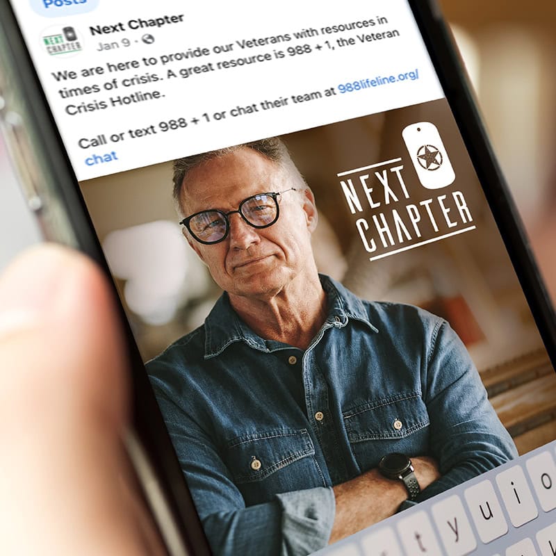
First, color. Each military branch has colors specific to that branch, and we wanted to stay away from established branding, so our veteran community didn’t feel that the program was specific to any particular branch. Additionally, we wanted to stay away from purples and yellows, which represent Joint Operations in the military and Gold Star Families that have experienced a combat loss. We chose these particular shades of green and gray to give a subtle nod to camouflage without being overt. The green is also symbolic of life, energy, and growth.
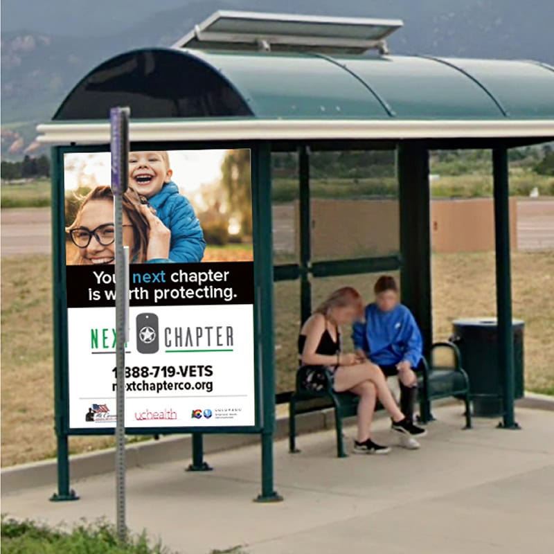
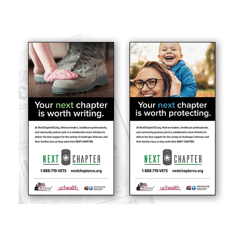
For symbolism, several important icons are incorporated into the logo design. You’ll notice that the A in the typography does not have a belt. In WWII, allied tanks identified each other with an inverted V to prevent friendly fire. Similar symbolism is still used today by our armed services. We chose this specific worn battle star, overlayed on a circle as a nod to the star that has historically been printed on most US equipment through the start of the Global War on Terror. The warn or battered image conveys service and endurance.
Our portfolio spans automotive, healthcare, nonprofits, tourism, large-scale events, and enterprise organizations — united by one common outcome: growth.